Directory

⚓ T305036 Menu: Support grouping of menu items
Page MenuHomePhabricator

Menu: Support grouping of menu items
Closed, ResolvedPublic3 Estimated Story Points

Assigned To
Authored By
Sarai-WMDE
Mar 30 2022, 9:09 AM
Referenced Files
F57636504: Captura de pantalla 2024-10-23 a las 13.07.32.png
Oct 23 2024, 11:12 AM
F57633704: image.png
Oct 22 2024, 2:07 PM
F57633693: image.png
Oct 22 2024, 2:07 PM
F57633684: Screenshot 2024-10-22 at 9.56.02 AM.png
Oct 22 2024, 2:07 PM
F57633678: image.png
Oct 22 2024, 2:07 PM
F57633226: image.png
Oct 22 2024, 10:08 AM
F57633206: image.png
Oct 22 2024, 10:04 AM
F57631648: image.png
Oct 21 2024, 9:30 PM

Description

Background/Goal

The <select> element can use the <optgroup> element to show groups of options. We should enable grouping and optgroup headers in the Menu component so users can show grouped MenuItems:

Screenshot 2024-06-11 at 5.33.21 PM.png (744×1 px, 89 KB)
Captura de pantalla 2024-09-16 a las 20.23.11.png (479×881 px, 103 KB)

User stories

  • As a designer or developer, I want to be able to provide a Select or other menu component that has named grouped options.

Design spec

Depending on whether menu groups have a clear title to include in the menu item set, they could be grouped in two different ways:

  1. Using headers: A prominent bold @color-emphasized header can be added as a title to group a set of menu items. Each group with a header will be separated by @spacing-75 (12px) for clearer distinction.
  2. Using dividers: In those cases where there is no clear title to include in the groups, a @border-color-muted divider can be used to separate them.
    image.png (1×1 px, 67 KB)

Component's Guidelines

Open questions

  • Should we design/build this as a special type of MenuItem, or design/build the headings into the Menu component instead? What's the most sensible way for developer users to add groupings of MenuItems?

Acceptance criteria (or Done)

Design

  • Design the Figma spec sheet and add it in this task
  • Update the component in the Figma library. This step will be done by a DST member.
  • Update the Menu guidelines including info about the grouping (patch 1073431)

Code

  • The Menu component is updated to enable grouping of MenuItems
  • Components that use the Menu component (e.g. Select and Lookup) should support grouped MenuItems
  • The grouped menu items should still be accessible to keyboard nav and voiceover (following guidance from the APG)

Event Timeline

There are a very large number of changes, so older changes are hidden. Show Older Changes
CCiufo-WMF renamed this task from Support optgroup-like headers in Menus to Menu: Support optgroup-like headers.Nov 29 2023, 3:18 PM
CCiufo-WMF renamed this task from Menu: Support optgroup-like headers to Menu: Support headers for grouping options.

while implementing a series of research recommendation for Wikifunctions, we noticed that in Figma it's possible to set a MenuItem to type "Header"

CleanShot 2023-11-13 at 12.27.18@2x.png (812×2 px, 149 KB)

but we later discovered that this is not possible in code/Codex (only a footer option is available), as described by this task. Given this use case, is there space to increase the priority of this task?

(as a general feedback, it would be helpful to have better parity between Figma and Codex to avoid any potential confusion)

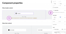
@AAlhazwani-WMF I've updated the MenuItem in Figma to reflect that the Menu Header is not implemented in Codex yet:

  1. Included a warning message below the component's prop/variant indicating that the Header is not implemented in Codex yet.
  2. Include the same message in the main component's description so designers can read it when using this variant.

Captura de pantalla 2023-11-29 a las 12.17.24.png (1×2 px, 255 KB)

We will review the rest of Figma components in T349020: Codex Figma library: update it to match the components guidelines in the Codex site to ensure they are aligned with the Codex demo, and we will indicate the variants/props that are not implemented yet in Codex.

NOTE: If you finally use this Menu Header in your project, please make sure to indicate the developers that this variant is not implemented in Codex yet, linking to this task if needed.
AnneT renamed this task from Menu: Support headers for grouping options to Menu, Select: Support grouping of options (like optgroups).Aug 29 2024, 3:31 PM
AnneT updated the task description. (Show Details)
CCiufo-WMF raised the priority of this task from Lowest to Needs Triage.Aug 29 2024, 3:53 PM

An idea I had as an interim solution for T362912 was to have the optgroups be a disabled option. That's a satisfactory workaround for T358934, I think.

I'm wondering if the optgroup is needed at all here. Looking at the Figma spec, won't this end up being a flat list with "Other" being one of the options?

The designs don't take into account community-configured grouping of block reasons, which is fairly widespread. See https://en.wikipedia.org/wiki/MediaWiki:Ipbreason-dropdown for example.

CCiufo-WMF triaged this task as Medium priority.Aug 30 2024, 8:38 PM
CCiufo-WMF moved this task from Backlog to Needs Refinement on the Design-System-Team board.

The designs don't take into account community-configured grouping of block reasons, which is fairly widespread. See https://en.wikipedia.org/wiki/MediaWiki:Ipbreason-dropdown for example.

Yep, understood now! We might not get to implementing and releasing this for a few sprints. I'd suggest you go with the proposed workaround in the meantime.

CCiufo-WMF set the point value for this task to 0.Sep 3 2024, 4:52 PM
bmartinezcalvo renamed this task from Menu, Select: Support grouping of options (like optgroups) to Menu: Support grouping of menu items.Sep 12 2024, 8:39 AM
bmartinezcalvo updated the task description. (Show Details)
bmartinezcalvo removed a subscriber: Sarai-WMDE.

Change #1073431 had a related patch set uploaded (by Bmartinezcalvo; author: Bmartinezcalvo):

[design/codex@main] docs: include guidelines for grouping of items in a menu

https://gerrit.wikimedia.org/r/1073431

I've updated both Figma spec and Guidelines (patch 1073431) including the grouping within Menu. Depending on whether menu groups have a clear title to include in the menu item set, they could be grouped in two different ways:

  1. Using headers: A prominent bold @color-emphasized header can be added as a title to group a set of menu items. Each group with a header will be separated by @spacing-75 (12px) for clearer distinction.
  2. Using dividers: In those cases where there is no clear title to include in the groups, a @border-color-muted divider can be used to separate them.
    image.png (1×1 px, 67 KB)

This task is ready to be implemented, so moving it to Needs Refinement.

bmartinezcalvo moved this task from Inbox to Needs Refinement on the Design-System-Team board.
bmartinezcalvo updated the task description. (Show Details)
CCiufo-WMF removed the point value for this task.Sep 27 2024, 2:57 PM

@bmartinezcalvo @DTorsani-WMF i wanted to share a few visual suggestions to the latest proposal. feel free to take those ideas into account or ignore them if it doesn't make sense.

headers
adding a spacer above the headers could visually unbalance the vertical rhythm. the bolden text might be enough to visually separate the headers from menu items. i was also wondering if setting the headers to color-base might drive too much attention, what about color-subtle?

currentproposal
image.png (616×722 px, 24 KB)
image.png (592×722 px, 23 KB)

dividers
adding a spacer above/below the dividers might make the first and/or last menu item of the menu visually unbalanced. if you look at 'menu item F' the top white space looks larger than the bottom space. i'm wondering if we could remove the spacers, so that the top/bottom spacing is always visually the same. also, given that the menu item hover state goes edge to edge, should also the divider go edge to edge? similarly to how we do it for the menu footer.

currentproposal
image.png (592×722 px, 22 KB)
image.png (528×722 px, 20 KB)

@bmartinezcalvo @DTorsani-WMF i wanted to share a few visual suggestions to the latest proposal. feel free to take those ideas into account or ignore them if it doesn't make sense.

headers
adding a spacer above the headers could visually unbalance the vertical rhythm. the bolden text might be enough to visually separate the headers from menu items. i was also wondering if setting the headers to color-base might drive too much attention, what about color-subtle?

currentproposal
image.png (616×722 px, 24 KB)
image.png (592×722 px, 23 KB)

@AAlhazwani-WMF thank you for these suggestions. We explored these and other design solutions and, after presenting them to other design team members, we decided to move forward with the Bold @color-emphasized with additional padding since this was the preferred option. We considered the header using @color-subtle without paddings was not scannable enough from the rest of menu items when tested with different menu combinations.

Captura de pantalla 2024-10-01 a las 11.43.07.png (672×1 px, 157 KB)
Captura de pantalla 2024-10-01 a las 11.43.43.png (644×1 px, 143 KB)
@color-emphasized with padding@color-subtle with no padding

dividers
adding a spacer above/below the dividers might make the first and/or last menu item of the menu visually unbalanced. if you look at 'menu item F' the top white space looks larger than the bottom space. i'm wondering if we could remove the spacers, so that the top/bottom spacing is always visually the same. also, given that the menu item hover state goes edge to edge, should also the divider go edge to edge? similarly to how we do it for the menu footer.

currentproposal
image.png (592×722 px, 22 KB)
image.png (528×722 px, 20 KB)

The small additional padding in the dividers version ensures a consistent 16px spacing between each item in the menu. Without this extra padding, the separation between the last item of one group and the first item of the next would be smaller than the spacing between items within the same group. So, although it creates a small inconsistency with the top/bottom paddings, I lean towards using it. @DTorsani-WMF
wdyt?

Captura de pantalla 2024-10-01 a las 11.52.59.png (1×938 px, 75 KB)
Captura de pantalla 2024-10-01 a las 11.54.07.png (1×930 px, 69 KB)
with additional paddingwith no padding

I think you may have meant to tag @AAlhazwani-WMF instead of Anne. But yes, I agree with the proposal and your justification, Bárbara.

fair enough, i usually favor visual/optical balance over mathematical consistency, but you're the deciders :) thanks for the swift feedback!

I think you may have meant to tag @AAlhazwani-WMF instead of Anne. But yes, I agree with the proposal and your justification, Bárbara.

Oh yes, I wanted to ping @AAlhazwani-WMF instead. Updating my comment above to avoid confusion!

I don't have a strong opinion either way, but just a note that if the padding is inconsistent, it'll be more noticeable through the interactive states, like on hover and click. Might be worth prototyping a bit before deciding.

CCiufo-WMF set the point value for this task to 3.
CCiufo-WMF renamed this task from Menu: Support grouping of menu items to Menu: Support named grouping of menu items.Oct 7 2024, 5:29 PM
CCiufo-WMF updated the task description. (Show Details)

Change #1082095 had a related patch set uploaded (by Anne Tomasevich; author: Anne Tomasevich):

[design/codex@main] Menu: Enable groupings of menu items

https://gerrit.wikimedia.org/r/1082095

Hey @bmartinezcalvo and others, after building this out I have a question about spacing.

This demo has an example of a menu that has menu groups and individual items that aren't part of a group (items 4, 7, and 8 are not part of a group). In my opinion, it's kind of hard to tell them apart since the items that are within a group aren't indented or anything. There's extra space around menu groups as prescribed by the design spec, but I don't know that this is enough to distinguish groups from individual items outside of a group.

image.png (1×1 px, 89 KB)

What do you think? Should we indent menu items within a group so it looks more like this? Or add dividers?

image.png (1×1 px, 100 KB)
El T305036#10248519, @AnneT escribió:

Hey @bmartinezcalvo and others, after building this out I have a question about spacing.

This demo has an example of a menu that has menu groups and individual items that aren't part of a group (items 4, 7, and 8 are not part of a group). In my opinion, it's kind of hard to tell them apart since the items that are within a group aren't indented or anything. There's extra space around menu groups as prescribed by the design spec, but I don't know that this is enough to distinguish groups from individual items outside of a group.

image.png (1×1 px, 89 KB)

@AnneT thank you for flagging this. Is there any real use case where both groups and individual elements are combined within the same menu? If yes, I think the best way to separate groups with headers from individual items is by using dividers. There are two types of groups: those with headers (the ones with a clear title to add) and those without headers. For the groups without headers, dividers can be used to visually separate them. This way, if there are individual elements within a menu that aren't grouped under a header, they could be grouped using a divider. Anyway, I would need to review a real use case with these types of individual items within a grouped menu to better understand it.

image.png (1×2 px, 170 KB)

What do you think? Should we indent menu items within a group so it looks more like this? Or add dividers?

image.png (1×1 px, 100 KB)

Since the start icon within the header is customizable, not all headers will include an icon. As a result, indentation wouldn’t be consistent in groups without icons. We previously explored using indentation and decided against it. Therefore, as commented above, I recommend using headers or dividers to group items in the menu.

image.png (958×722 px, 36 KB)

Thanks for your response @bmartinezcalvo! I couldn't find any uses cases, so I think we can assume that this won't come up very often and we don't need to prioritize handling this use case in the most ideal way. I do think that we need to make sure the menu is flexible enough to handle any combination of groups and individual items, though.

I've been playing around with the dividers and I want to echo a lot of the suggestions that @AAlhazwani-WMF has made. It is extremely complicated in the code to try to add space between menu items/groups sometimes, and place the divider in the middle of that group, AND make the interactive states look good (as @CCiufo-WMF mentioned in a comment above.

Here's a screenshot in the middle of an attempt to get the dividers working (you can see the divider above item "four" has space between it and the vertical edge of the menu; I hadn't gotten around to making all the dividers like that at the time of this screenshot):

image.png (922×680 px, 50 KB)

IMO, this would look better if the dividers connected with the menu item rather than leaving a 6px gap, and if the dividers went the full width of the menu. In fact, it would be so complicated to achieve what's in the design that I'd like to propose we simplify things by not adding extra space between groups and making the dividers span the full width of the menu. Adding the menu groups has already added a lot of complexity to the Menu code, and I'd like to avoid adding more unnecessarily. Here's a proposal that's similar to what Amin suggested above:

Screenshot 2024-10-22 at 9.56.02 AM.png (1×782 px, 65 KB)

And here's what it looks like in a more realistic menu that just has two groups and two individual item at the end:

image.png (896×812 px, 61 KB)

We could also just add dividers between all groups if that seems more consistent:

image.png (904×788 px, 62 KB)

Change #1082271 had a related patch set uploaded (by Anne Tomasevich; author: Anne Tomasevich):

[design/codex@main] Menu components: Enable use of menu groups

https://gerrit.wikimedia.org/r/1082271

Change #1082273 had a related patch set uploaded (by Anne Tomasevich; author: Anne Tomasevich):

[design/codex@main] docs: Link to the menu group docs

https://gerrit.wikimedia.org/r/1082273

IMO, this would look better if the dividers connected with the menu item rather than leaving a 6px gap, and if the dividers went the full width of the menu. In fact, it would be so complicated to achieve what's in the design that I'd like to propose we simplify things by not adding extra space between groups and making the dividers span the full width of the menu. Adding the menu groups has already added a lot of complexity to the Menu code, and I'd like to avoid adding more unnecessarily. Here's a proposal that's similar to what Amin suggested above:

I spoke with @AnneT about this today. For the purposes of keeping the complexity of this task manageable, we're going to proceed with the simpler design approach for now: full-width dividers, and no 6px gap between "items" and "groups".

We can review a working demo which uses this approach when ready (before the underlying patches have been merged) – either this sprint or next sprint. If there is a compelling reason to consider the alternate design, we can do so at that point.

Change #1082287 had a related patch set uploaded (by Anne Tomasevich; author: Anne Tomasevich):

[design/codex@main] docs: Update Lookup with suggestions demos to use groups

https://gerrit.wikimedia.org/r/1082287

IMO, this would look better if the dividers connected with the menu item rather than leaving a 6px gap, and if the dividers went the full width of the menu. In fact, it would be so complicated to achieve what's in the design that I'd like to propose we simplify things by not adding extra space between groups and making the dividers span the full width of the menu. Adding the menu groups has already added a lot of complexity to the Menu code, and I'd like to avoid adding more unnecessarily. Here's a proposal that's similar to what Amin suggested above:

I spoke with @AnneT about this today. For the purposes of keeping the complexity of this task manageable, we're going to proceed with the simpler design approach for now: full-width dividers, and no 6px gap between "items" and "groups".

We can review a working demo which uses this approach when ready (before the underlying patches have been merged) – either this sprint or next sprint. If there is a compelling reason to consider the alternate design, we can do so at that point.

Ok, let's move with the simplest approach for this first version. We can revisit this later if needed.


@AnneT some things I'm detecting while reviewing the Menu with groups patch:

  1. Header's description can optionally be used to include additional info about the header's title. The most common usage will be not displaying this description to avoid too long menus. And, in case the description is displayed, it should be as subtle as possible. So it should use a smaller text size (12px on desktop, 14px on mobile)
  2. As recommended in the spec and guidelines, we should avoid combining headers and dividers to separate groups within the same menu. We will use headers when there is a clear title to add to the group, and we will use dividers to separate groups of items when there is no clear title to include to the groups. In order to show these different ways of grouping items within a menu, I would create 2 different demos: "Menu groups with headers" and "Menu groups with dividers".
  3. Since the Menu component is including now notable customization, would it be possible to create a Configurable demo in this Menu page to customize the Header, Dividers, and Footer?

Captura de pantalla 2024-10-23 a las 13.07.32.png (701×792 px, 63 KB)
  1. Header's description can optionally be used to include additional info about the header's title. The most common usage will be not displaying this description to avoid too long menus. And, in case the description is displayed, it should be as subtle as possible. So it should use a smaller text size (12px on desktop, 14px on mobile)

Done!

  1. As recommended in the spec and guidelines, we should avoid combining headers and dividers to separate groups within the same menu. We will use headers when there is a clear title to add to the group, and we will use dividers to separate groups of items when there is no clear title to include to the groups. In order to show these different ways of grouping items within a menu, I would create 2 different demos: "Menu groups with headers" and "Menu groups with dividers".

I went ahead and added the ability to visually hide the label of a menu group. I would recommend against referring to these as "menu groups with dividers", because that implies that they do not have headers/labels - they are required to have labels for assistive technology, but the labels can be visually hidden. I also would recommend we only show a single demo of menu groups for 2 reasons: first, because we're aiming to keep the demo pages as concise as possible, and second, because I think we should encourage people to have visible labels for menu groups since they're easier to understand than groups with hidden labels. Designers will still know that you can make menu groups without visible labels if they refer to the Figma spec, and developers will know how to do it by reading the Vue usage section.

I have added a demo of a menu with many combinations of groups and individual items to the dev Sandbox for you to review. Of course, this is a very unrealistic example, but you can at least check that the dividers are being added appropriately (in this case, they're added between every menu item/group except when there are 2 groups with visible labels next to each other.

  1. Since the Menu component is including now notable customization, would it be possible to create a Configurable demo in this Menu page to customize the Header, Dividers, and Footer?

This is going to be really tricky to achieve because the way these things are configured is not easy to do with the controls we currently have available. Menu groups are configured by creating nested objects and arrays in the menuItems prop, so it's not a matter of turning groups on or off. I do think we should consider how we might create a configurable Menu demo, but think we should do that after T371806 as part of a new task.

CCiufo-WMF renamed this task from Menu: Support named grouping of menu items to Menu: Support grouping of menu items.Oct 28 2024, 3:46 PM
CCiufo-WMF updated the task description. (Show Details)

Change #1073431 merged by jenkins-bot:

[design/codex@main] docs: include guidelines for grouping of items in a menu

https://gerrit.wikimedia.org/r/1073431

Change #1082095 merged by jenkins-bot:

[design/codex@main] Menu: Enable groupings of menu items

https://gerrit.wikimedia.org/r/1082095

Change #1082271 merged by jenkins-bot:

[design/codex@main] Menu components: Enable use of menu groups

https://gerrit.wikimedia.org/r/1082271

Change #1082273 merged by jenkins-bot:

[design/codex@main] docs: Link to the menu group docs

https://gerrit.wikimedia.org/r/1082273

Change #1082287 merged by jenkins-bot:

[design/codex@main] docs: Update Lookup with suggestions demos to use groups

https://gerrit.wikimedia.org/r/1082287

Test wiki created on Patch demo by ATomasevich (WMF) using patch(es) linked to this task:
http://patchdemo.wmcloud.org/wikis/a5d0a31f72/w/

Test wiki on Patch demo by ATomasevich (WMF) using patch(es) linked to this task was deleted:

http://patchdemo.wmcloud.org/wikis/a5d0a31f72/w/