Sales reporting dashboards play an important role in the success of sales strategies. They ensure transparency and empower sales leaders to make decisions based on data. Such dashboards help track performance indicators, identify patterns, and establish targets that drive business growth.
Creating a dashboard doesn’t have to be complicated. You have several options, such as using pre-designed templates, building a dashboard yourself with the help of a tutorial, or even seeking professional assistance. And, of course, there are plenty of tools that can make it easier. For example, solutions like Coupler.io can help you build a self-updating sales dashboard powered by fresh data. The data will be automatically collected from all your apps, such as Pipedrive, Salesforce, HubSpot, and others.
In this article, we explore 11 sales dashboards you can use to streamline your sales process. We also give you some useful tips on automating your dashboard and making it always up-to-date and analysis-ready with no manual effort. Let’s dive in!
11 sales dashboard examples to boost sales efficiency
These dashboards provide insights by allowing you to monitor real-time performance and analyze trends. They can be an important data analytics tool that helps you make your sales process more data-driven.
1. CRM dashboard for Pipedrive, Hubspot, or Salesforce – free templates
Here’s an example of a comprehensive CRM dashboard that gives you a detailed overview of your sales pipeline. Good news – this dashboard is also offered as a free template. So you can use it and get a copy of this dashboard with your data – it will be visualized automatically. This dashboard is automated with Coupler.io, so it regularly pulls fresh data from Pipedrive to update the numbers. It can also work with Salesforce and HubSpot.

In this visualization, you can monitor the most important metrics, such as total sales, win rate, close rate, and open deals. You can track deal statuses with the Deal stages breakdown overview, as well as analyze your pipeline from different angles and see how your team performs.
This free template is available for Salesforce, HubSpot, and Pipedrive.
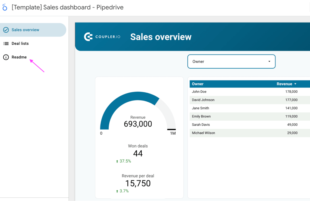
2. Sales overview dashboard for Pipedrive – a free template
This Sales Overview Dashboard is created by Coupler.io and is powered by fresh data, automatically pulled from Pipedrive. Thanks to the automation, the dashboard is live and self-updating, so you can keep track of your metrics in near real-time.

This sales dashboard presents some important metrics that you may want to monitor. For example, total revenue, revenue per deal, won deals, revenue per salesperson, and more. You can filter information based on owner and organization criteria, date, etc.
The best thing about this sales overview dashboard is that we offer it as a free template. So if you use Pipedrive to organize your sales process, you can get a copy of this dashboard with your data literally in several minutes. You’ll just need to connect your Pipedrive and Looker Studio accounts to Coupler.io, and your data will be visualized automatically. After that, you can customize your dashboard in Looker Studio if needed.
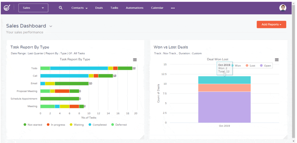
3. Sales analysis dashboard
This Sales Analysis Dashboard allows you to monitor and analyze your sales process in detail. You can quickly view the sales through a moving needle, while individual bar graphs provide a breakdown by product category, sales manager, region, state, and quarter. For tracking short-term changes, there’s also a line graph that shows trends. This dashboard is interactive, so you can play around with the values and see how it works.

Moreover, the dashboard includes a date range filter, which adds flexibility, enabling you to zoom in on different periods. With these features at your disposal, you can easily analyze various aspects of your sales data, see what works best, and adjust your strategy accordingly. The dashboard is designed to provide real-time insights.
This sales analysis dashboard is also created by the Coupler.io team. If you want to use it as a template or build a tailored data visualization for your case, you can contact the Coupler.io’s data analytics team for help.
4. Sales performance dashboard

The Sales Performance Dashboard is created to thoroughly examine sales trends in categories and regions. The line graph for each category displays the sales of product categories, allowing for a comparison of their performance. What enhances the usability of the dashboard is the line graphs for regions to provide a focused analysis of local trends.
To zoom in further, you can apply filters based on region and state, as well as date filters. This dashboard empowers sales managers and business owners to narrow their analysis to timeframes and geographical areas. It’s an adaptable tool for monitoring sales performance and aligning strategies with market dynamics.
5. Customer Behaviour Dashboard

The Customer Behaviour Dashboard is designed to analyze customer behavior over time, focusing on two factors – how often customers come back to make another purchase and the total value they bring to the company throughout their customer lifetime. These analysis tables provide information about customer loyalty and long-term business performance.
The repurchase rate table shows the percentage of customers who return for purchases, while the lifetime value table measures the contribution of each customer. With the added ability to filter data by specific date ranges, users can easily focus on periods of interest.
By providing these insights, the dashboard serves as a tool for monitoring customer retention, identifying growth opportunities, and projecting future business results.
6. Sales activity dashboard
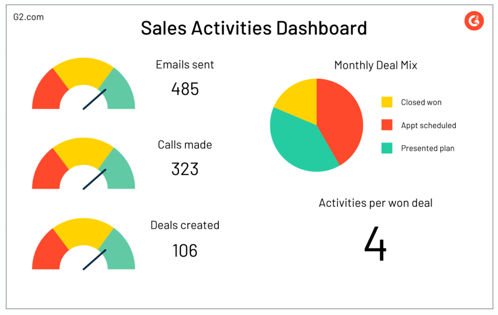
This Sales Activity Dashboard can be useful for sales teams who want to keep an eye on their day-to-day operations. It provides insights into the activities of both team members and the team as a whole. In particular, you can track activities such as phone calls, emails, and appointments. This allows for an understanding of how time and effort are being used.
Important metrics to consider include activity counts, conversion rates, and response time. The benefits of using this dashboard are numerous. It helps identify areas where efficiency can be improved, highlights trends in customer engagement, and ensures that daily activities are aligned with sales goals. Overall, it is a tool that enhances productivity and strategic focus.
7. Sales pipeline dashboard

Sales managers frequently rely on a Sales Pipeline Dashboard to visualize how prospects move through the sales funnel. This dashboard offers an overview of each stage of the sales process, measuring performance indicators such as conversion rates for leads, average deal size, and pipeline velocity.
By gaining insights into bottlenecks and success rates, it becomes easier to forecast future challenges and opportunities and allocate resources effectively. The dashboard plays a role in making decisions based on data and aligning sales strategies with market opportunities.
8. Individual sales rep dashboard

The Sales Rep Dashboard for individuals provides a view of a sales representative’s performance, tasks, and progress towards their goals. It assesses performance indicators such as meeting quotas, converting leads into deals, and determining deal values.
By offering tailored insights, it encourages self-improvement, aligns objectives with team targets, and fosters a culture of accountability and growth. This dashboard serves as both a source of motivation and guidance for each sales representative in their pursuit of excellence.
9. Sales leaderboard dashboard

The Sales Leaderboard Dashboard is designed to foster a competitive and engaging atmosphere by displaying rankings based on performance metrics. It is regularly used during team meetings to boost motivation by recognizing achievements and encouraging competition.
Tracking sales volume, closed deals, and revenue generation, it helps identify top performers and promote best practices. This dashboard works as a catalyst for improving performance and enhancing team motivation.
10. KPI dashboard for sales

The Sales KPI Dashboard is designed for executives as it helps connect sales activities to long-term business strategies. By focusing on sales performance indicators like revenue growth rate, customer lifetime value, and churn rate, it offers a perspective and helps outline future progress.
The dashboard assists in aligning sales tactics with business objectives, allowing for responses to market changes and promoting an understanding of success metrics. In general, it can work as a guiding compass for a sales team.
11. Win/loss dashboard
The Win/Loss Dashboard provides insights into the intricacies of winning and losing deals. It conducts an analysis of win/loss ratios, customer feedback, and competitive positioning to uncover patterns and define the success factors.
These insights play a role in improving sales techniques, understanding customer behaviour, and refining strategies. The Win/Loss Dashboard becomes a learning platform that can drive sales success.
How to build sales performance dashboards?
Sales performance dashboards turn data into insights. But how do you create a dashboard that is really useful and meaningful? Let’s see your options:
- Use Templates
Creating a dashboard from a template is a great way to start, as most of the work is already done. For example, you can use an automated sales dashboard template by Coupler.io to get a visualization of your sales data in minutes. As a result, you will receive an automated live dashboard that will regularly pull fresh data from Pipedrive. We will look into this in more detail in the next section.
- DIY from scratch
For those who prefer a hands-on approach, there’s an option to build your sales dashboard yourself. This gives you a lot of customization opportunities and allows you to create a data visualization tailored to your specific needs and goals. The downside, however, is that it can take quite a lot of time.
To make this process easier, you can build your dashboard by following our Looker Studio tutorial for beginners. It will guide you through each step, making the process simpler and smoother.
- Hire professionals
Another option is to request help from a professional data analytics team to create a data visualization for you. This is especially convenient if you need to create an advanced dashboard or need help with analyzing your data.
For example, you can consider Coupler.io’s data analytics team. We can help you with data visualization, business analytics, data infrastructure, and data automation.
You can choose one of these methods to create a sales dashboard that works for you.
Example: How to create a sales reporting dashboard from a template
Using Coupler.io’s sales reporting dashboard template is very simple. It only takes a few minutes to create a dashboard with your dataset.
Step 1: Create a Coupler.io account by signing up.
Step 2: Open the sales overview dashboard template and navigate to the Readme tab.
Step 3: Click on the link provided on the Readme tab to set up data transfer from your sales database platform to Looker Studio.

Step 4: As the sales data source is Pipedrive, in this dashboard, you need to connect Pipedrive to Coupler.io.
First, make sure you are logged in into your Pipedrive account. Then, click Connect.

A new pop-up will appear. Click Allow and Install.
The Pipedrive account is now connected. Click Finish and Proceed.
Step 5: Select Transform data to preview your dataset and ensure everything is correct before clicking Proceed.

Step 6: Follow the on-screen instructions to connect your Looker Studio account to Coupler.io.
Coupler.io will transfer your data and create a ready-to-use dashboard. Click View results, then press Connect -> Create report.

The copy of the dashboard with your data is ready! You can now use Looker Studio to modify your dashboard if needed, add more data, rearrange blocks, add and delete sections, etc.

Frequently asked questions about sales dashboards
What are sales dashboards?
A sales dashboard is a data visualization that draws sales metrics from multiple sources for tracking and analytics. It gathers data such as leads, conversion rates, and revenue trends. This is a convenient and efficient way to organize your sales data, translate it into insights, and make your sales process data-driven.
Why are sales dashboards important?
Sales dashboards serve as a hub for your sales operations. They provide real-time analysis of sales data, allowing for gleaning insights and making adjustments. By presenting sales data in a concise manner, these dashboards make complex trends and correlations visible, giving you more information to work with and enhancing the efficiency of your sales team. Tracking performance becomes a simpler process as well. These dashboards are vital in facilitating strategic and data-driven decision-making by condensing huge amounts of information into an analysis-ready format. Additionally, they promote transparency and collaboration by enabling leadership and other teams to access the latest data at any moment.
Benefits of sales dashboards
A sales dashboard provides an interactive way to present sales information. This allows sales managers and business owners to quickly evaluate performance, identify challenges, and make informed decisions.
Moreover, there are other benefits associated with using sales dashboards.
- Real-time insights: Sales dashboards offer real-time updates on important metrics. This enables quick responses and timely strategic adjustments.
- Improved decision-making: With visualized and well-organized data, sales managers can easily identify trends, new opportunities, and areas of concern. This leads to decisions driven by data.
- Enhanced collaboration: Visualized data is accessible, easy to work with, and easy to share across different teams. This ensures transparency and facilitates collaboration. Whether you are sharing it with a marketing team or the C-suite, a dashboard is a great way to present the results of your work and keep everyone on the same page.
- Customization: Customize your dashboard based on the aspects that matter most for your business, whether it’s retail, software development, or real estate segment. You can keep track of the KPIs that drive your success.
- Accessibility: As sales dashboards can be available on different devices, they can be accessed anytime and anywhere. Stay connected and keep track of your sales performance even on the go.
- Saving time: Bid farewell to manual data collection and compilation as professional sales dashboards automate this process. This gives you access to fresh information with zero manual effort and frees up time for strategic tasks.
What should a sales dashboard include?
A sales dashboard that is well-designed strikes a balance between functionality and relevance. It should incorporate real-time sales data, ensuring that you always have the latest information at your disposal. Adding time and metric filters allows you to analyze data more flexibly. When selecting metrics, aligning them with the sales objectives and KPIs is important. Moreover, presenting data through visualizations concisely and clearly is crucial. A comprehensive sales dashboard should also help you compare the target and actual performance, accompanied by notes that provide context, if needed.
How to choose the best sales dashboards?
When selecting a sales dashboard, here are a few factors to consider.
- Key metrics: Check for the KPIs included in the dashboard. Does it have the KPIs you track? Do those KPIs make sense for your business?
- Customization: The dashboard should be in line with your objectives and meet your specific needs.
- Clear data visualization: The sales dashboard should be neat and easy to read for viewers. Having too much data in a single dashboard can also be confusing.
- Real-time updates: The whole point of creating a sales dashboard is to save time on reporting. If you need to pull sales data every week manually, then it defeats the purpose. So, for the best results, your dashboard should support automatic real-time updates.
Simplifying your sales with sales reporting dashboards
Sales reporting dashboards are not just tools, they are a part of a sales strategy that empowers sales leaders to make informed decisions based on data. Whether you are keeping track of performance indicators, setting targets, or identifying trends, these dashboards play a crucial role in enhancing business performance.
Building a dashboard doesn’t have to be complicated. You have options like using templates, creating a visualization from scratch, or even hiring professionals for assistance.
To summarise, sales reporting dashboards can streamline the sales process and help you reach your goals. And Coupler.io can take care of your data, automatically collecting it across your organization and channeling it into your sales dashboard on a schedule.