Marketing Data Visualization – Reports and Dashboard For Wise Decision-Making
Marketers work with tons of marketing data, including ad campaign performance, customer information, sales numbers, website analytics, and so on. This data comes from multiple sources and holds different insights. Every savvy marketer’s task is to extract these insights to understand their marketing strategy’s strengths and weaknesses. One of the ways to complete this task is to present the data in a visual form using charts and graphs. How you can do this, what benefits you can get, and many other questions about marketing data visualization are covered in this guide, so let’s go!
Marketing data visualization – what is it, and what does it looks like?
Data visualization is the process of eliciting insights from the raw data and displaying them in a visually understandable form.
Therefore, data visualization in digital marketing is the process of eliciting insights and visualizing them based on marketing raw data. The marketing data that you can represent in the different forms of graphs and charts includes:
- website analytics (page views, conversions, bounce rate, etc.)
- email marketing (open rate, click-through rate, unsubscribes, etc.)
- social media (shares, subscribers, approval rate, etc.)
- advertising (clicks, impressions, cost per click, etc.)
- video marketing (views, likes, sign-ups, etc.)
- Other marketing activities
Example of data visualization for marketers
When talking about data visualization for marketing analysis, the first thing that comes to mind is a chart of any form: line chart, column chart, funnel chart, and so on. For example, here are different website analytics metrics visualized with a line chart in Tableau.

However, data visualization is not only about charts and graphs. Pivot tables allow you to elicit valuable insights without actually visualizing data. So, we can include them in data visualization in digital marketing as well. Here is an example of marketing website performance in the form of a pivot table in Google Sheets:

And, of course, the most advanced way to present your marketing data visually is a dashboard. Dashboards can accumulate multiple metrics in different forms and even let you filter or group the data. A comprehensive dashboard for CMOs can even include several visualized reports. Here is an example of a customer base built by data experts at Coupler.io using PowerBI.
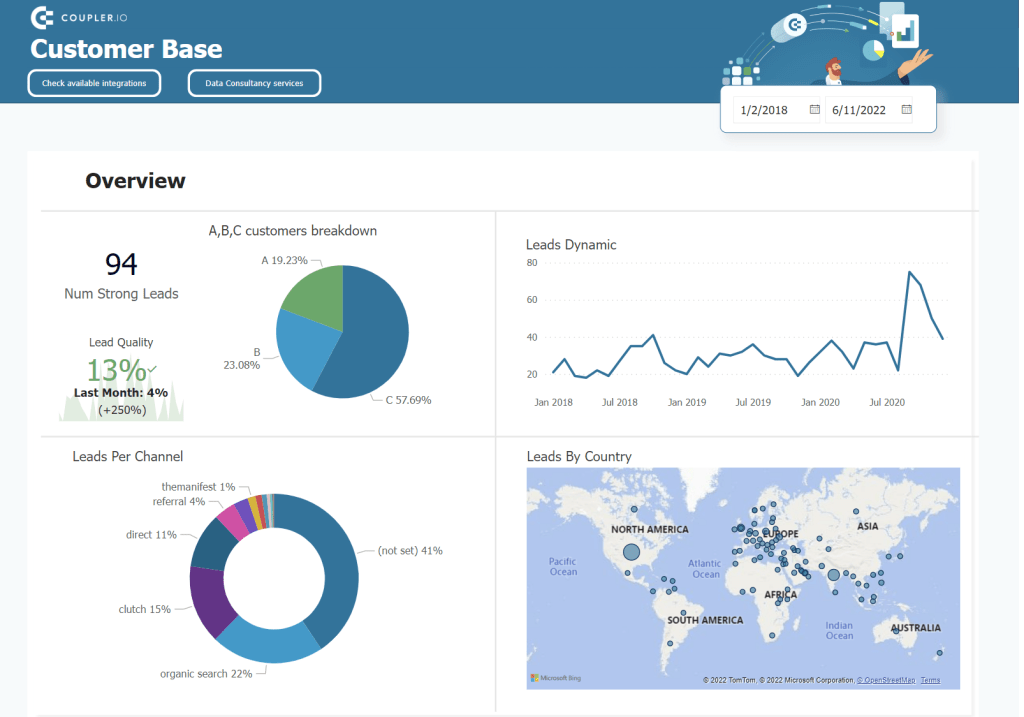
So, as you understand, marketing data visualization can be very different depending on your goals. But is it possible to do analytics without any visualizing data? Let’s dive into this.
Why is data visualization important for marketing analytics?
When data is visualized, it’s much easier to analyze the insights it contains to streamline decision-making.
Visual data representation allows you to turn numbers into some meaningful conclusions and translate metrics into decisions. For example, here is what the raw marketing data exported from Google Analytics 4 to Google Sheets looks like.
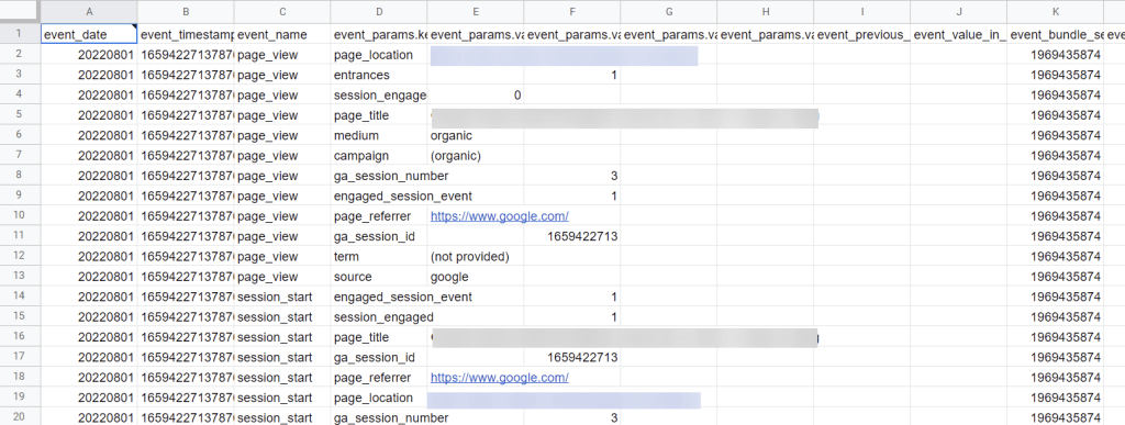
These records do not hook your attention. Moreover, if you share this report with some stakeholders, they may not even get the idea of how good or bad these metrics are. Marketing data visualization can solve this issue.
This time you can even do without any charts or graphs. For example, the following dashboard uses some formulas to derive insights and a bit of Google Sheets conditional formatting. As a result, you get the marketing data visualized in a clear and comprehensible way.

You do feel the difference, don’t you? Well-prepared Google Sheets dashboards can significantly speed up data analysis and enable faster decision-making.
Since we’ve mentioned that charts are not an indispensable element of data visualization for marketing, let’s actually look at what types of visualizations you can opt for.
Types of marketing data visualization
Imagine that you’re building a marketing dashboard where you’re going to display different metrics. Some of them will be shown as simple figures, others will display a monthly trend using a line chart, and so on. There could be different marketing data visualization options to choose from, and we’d like to introduce the most popular ones below.
Pivot tables
We’ve already mentioned pivot tables at the beginning of the text and even dedicated a separate publication to using pivot tables in Google Sheets.
A pivot table is a type of data visualization by reorganizing your data in a way efficient for extracting conclusions. Pivot tables are commonly used in spreadsheet apps, such as Google Sheets or Excel. At the same time, you can also ‘pivot’ data in more sophisticated BI tools, such as Tableau or Looker Studio (former Data Studio). Here is an example of a pivot table in Google Sheets that displays the monthly traffic split (unfortunately, we can’t show the exact numbers :)).

Scores & indicators
For some metrics, you may need to just show a KPI or value that will refresh automatically. It’s also a type of data visualization that can be displayed via a score or indicator block. However, it’s unlikely that you will only use indicators to visualize all of your data. In most cases, these are complementary elements for advanced dashboards. Here is what they may look like:

Line charts
Line charts or line graphs are the best type of data visualization in marketing to display dynamics or trends over time. Basically, this type of chart is represented by a line stretching within a 2D space between X and y coordinates. On the chart, you can put one or several lines that will show the difference or relation between several points. Here is an example of a line chart that shows the monthly dynamics of leads.
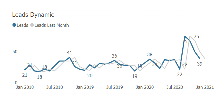
Make sure not to confuse a line chart with an area chart.
In the line chart, you have independent lines for each metric.
In the area chart, each line is added on top of another, and the area between them is colored by metric color. On top of the area chart, you can see the sum of all metrics. Here is an example of an area chart for lead creation dynamics per channel.

Column and bar charts
Both types of charts, column and bar, are used to compare multiple values side-by-side. The difference between them is the orientation. Column charts are represented by vertically located rectangles, namely columns. Here is an example of a column chart comparing a few metrics (impressions, conversions, acquisitions) by the type of device (desktop, mobile, and tablet).

Bar charts are represented by horizontally located rectangles.

Tip: if you have long value names, like in the image above, use horizontal orientation. It will make your data visualization easier to read.
In addition, bar charts and column charts can display a two-sided comparison: between values and comparison within a value. In this case, they contain a few color-coded sections like this:

Pie charts
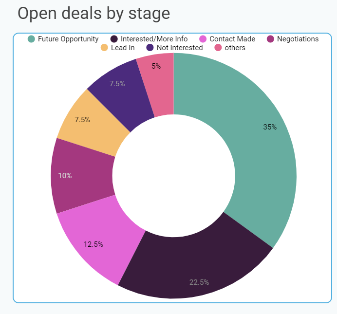
A pie chart displays smaller portions or pieces of a whole value. For example, your pipeline consists of several stages, and the number of open deals at each stage differs. A pie chart will be perfect to show this difference:
Funnel charts
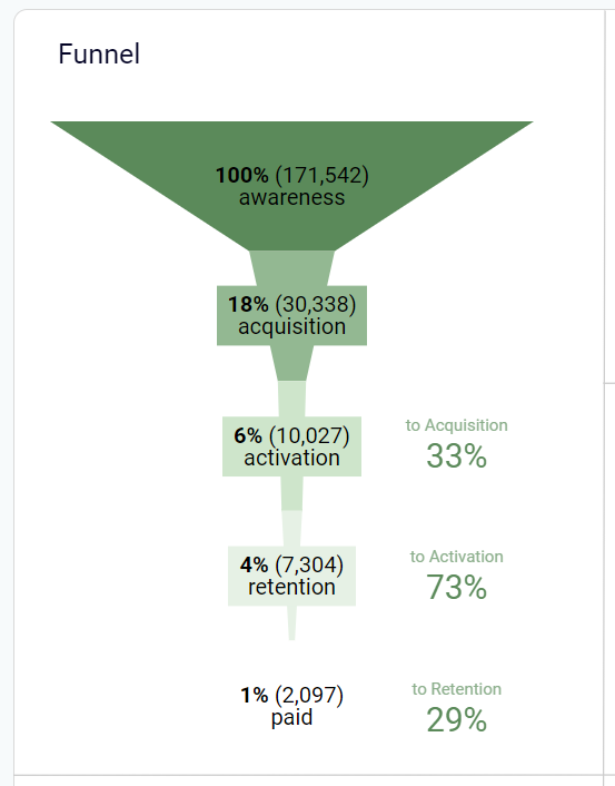
As the name suggests, a funnel chart is a chart showing a path between stages of a funnel or pipeline and the metrics per each step. Funnel charts are a perfect representation of sales or marketing funnels.
Geo maps
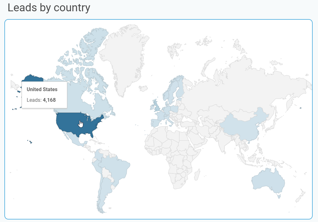
If you are analyzing data by its geographical value, you can display it on an actual map like this:
Other charts for marketing data visualization
We’ve introduced the most popular and widely used types of graphs. However, there are many other options that you probably would like to choose for data visualization in digital marketing:
- Scatter charts or plotted graphs – display the relationship between two variables.
- Bubble charts – modified scatter charts with an added third dimension – bubble size.
- Dispersed charts – display data sections by circle color and the data volume by circle size
- Treemaps – display hierarchies and comparisons between subcategories and categories.
- Polar charts or polar area diagrams – display relationships between several variables.
Probably, there are even more of that. But in the majority of cases, the mentioned charts are enough to meet your data visualization needs. However, the main point here is not the type of data visualization for marketing to choose. The most important thing is to visualize your data in an efficient way. Let’s talk about this.
Data visualization for marketers – what the flow looks like
Data visualization in marketing is a sophisticated process that consists of a few steps from collecting data to actually visualizing it. We’ll go through it for you to better understand the effort each data visualization holds.
Define the goal of marketing data visualization
Everything starts with a vision – what sort of visualization do you need to build? It can be a simple report with a few diagrams that won’t require much effort to create. The purpose of such reports is to share specific information with stakeholders.
On the other hand, you can aim to build an interactive dashboard with multiple filters and charts. It will require not only creativity in terms of visualization but also tech-savviness to automate data flow and make the dashboard self-updating. Such dashboards are valuable for day-to-day analytics and making significant decisions, such as billing model change or even business scaling.
Collect data to be visualized
The next is, probably the most important step – data collection. You already understand what sort of data visualization for marketers you’re building. So, you need to get the marketing data to be visualized. You can find it in different places, including analytics tools, such as Google Analytics; email marketing tools, such as ActiveCampaign or Mailchimp; CRM tools, such as HubSpot; and many other sources.
It’s a common case when you need to visualize data brought from different sources. The best practice here is to load the data into a single repository, for example, Google BigQuery. You will store the data in one place, and it will be easier to visualize or link it to a dashboard.
This step also covers the setup of an automated data flow. This means that you not simply export data from your sources, but integrate sources with your repository. As a result, the data from your marketing apps streams to a single destination either on a schedule or on a trigger. It’s a crucial element to make your future dashboard self-updating.
Transform marketing data
The information you load from your marketing apps usually contains a lot of meaningless records that you won’t need when making a data visualization. For example, here is the raw data loaded from LinkedIn Ads:

So, you will need to clean or refine your data before visualizing it. This can also cover making different calculations or querying to filter, group, or sort your records. Depending on the tool you use for storing data, you can perform the data transformation before or after loading, the so-called ETL or ELT. Only once your data is cleaned, you can get to visualization.
Design how to visualize marketing data
At this step, you’ll need to answer many questions about your expected data visualization, such as:
- What background color to set
- What visualization elements to choose
- How to arrange charts and other visualizations
- What filters to set and where to locate them
- How big the layout should be
- And many others
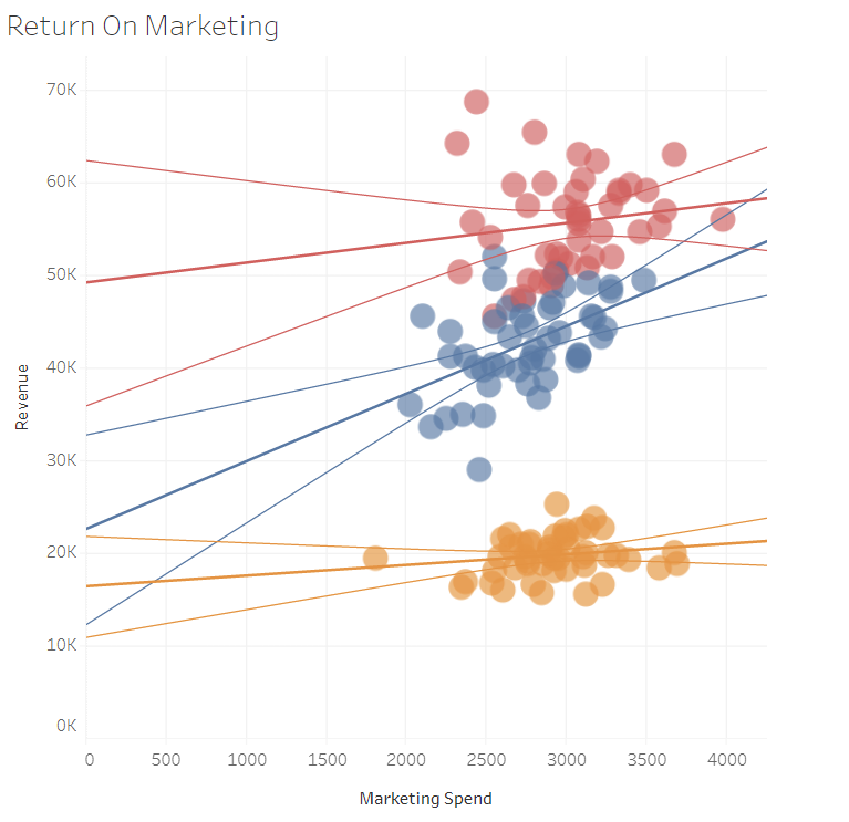
All these questions will help you make a data visualization for marketers that will be appealing and comprehensible. A bad choice of a visualization element or improper layout may lead to making your dashboard or report unclear, puzzling, or simply useless. For example, the following visualization is not quite intuitive, and you may require an additional explanation of how to read it:
In comparison, this visualization is quite clear and readable for almost anyone, even those not related to the project.

How to make marketing data visualization
Basically, there are three ways to create marketing data visualization:
- Do it yourself with the help of a data visualization tool
- Onboard a data analyst
- Use a service of professional data analytics experts
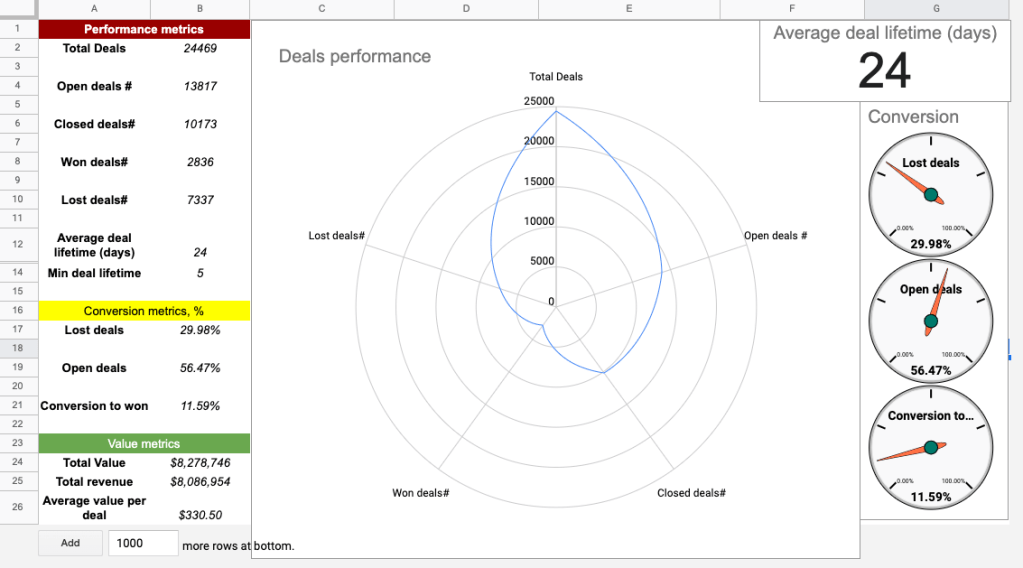
DIY data visualization means that you can actually make it with your hands or add a data analyst to your team. The former won’t be very efficient since you’ll need to master the chosen BI tool and learn how to use it step by step. As a result, you can end with something like this or better, of course.
Recruiting a data analyst will require additional effort and resources to launch a position, find and filter candidates, run interviews, and many other steps of the hiring process.
So, the most actionable way to bring your desired marketing analytics dashboard to life is to call on a professional data analytics service provider like the one by Coupler.io. Let’s see what benefits it can offer.
Reliable and efficient data visualization for marketers
Data analytics consulting service by Coupler.io is a team of experienced data analysts who can solve any data-related task from simple data automation to data infrastructure setup. Marketing data visualization consulting is what these data enthusiasts deal with quite frequently. Take a look at one of the many dashboards they can boast of:
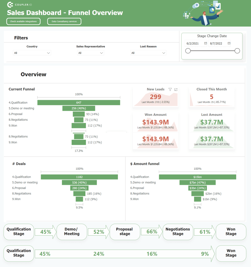
This analytical instrument contains a few data visualization elements that display the SaaS product funnel. It looks neat and clear – you won’t need an additional guide to learn how to read this dashboard. Metrics are understandable, filters are intuitive, and the chosen design looks appealing. Well, you can argue the latter since tastes differ 🙂.
What is inarguable is that this dashboard is a solid tool for data-driven decision-making. With it, you can identify the weak points of your product funnel and react accordingly. And this is probably the most valuable benefit of data visualization as a whole – make your decisions powered by data, not intuition.
If you feel that your marketing data analytics will benefit from what the Coupler.io team does, do not hesitate to hire them.
Those who prefer to use their own powers for data visualization in marketing, pay attention to the following useful best practices.
Best practices of data visualization for marketing
Use quality data for marketing analytics visualization
We’re pretty sure that it’s not worth additional yatter, but let’s refresh your memory about five key characteristics of quality data:
- Accurate
- Complete
- Reliable
- Relevant
- Up-to-date
This is a sort of a checklist to complete before doing any visualization with your marketing data.
Choose the right visualization for data sets
The type of visualization should correspond to the data set to be visualized. This will let you convey the main message of your data visualization in the most effective way. For example, use line graphs to show progress or regression, and go with bar charts to display comparison.
If a data visualization does not fit the data it presents, the information can be misinterpreted, causing stakeholders confusion.
Keep your data visualization design simple
You will achieve the top efficiency of your dashboard and reports if they are intuitively understandable. Of course, you won’t be able to disclose everything through visualization, for example, what variables are in your MRR formula. Nevertheless, the best data visualization is one that does not require much cognitive load.
The rule of thumb is to avoid visualization elements that require a high processing time of the human brain. It should take just a few seconds for a stakeholder to understand charts. Use consistent shapes, colors, fonts, and other design elements that will not overload the user’s cognitive process.
Declutter your data visualization
The metrics you put on your visualization should be logically interrelated to complement each other and create a whole picture of the dashboard. For example, if your visualization is dedicated to marketing channels’ performance, the information about retention rate or LTV may look out of place.
Besides, it’s important to only keep the information that will bring value to stakeholders – allowing them to build decision-making based on the data. All the vanity metrics and graphs should be cut off to make your dashboard and its visualization as efficient as possible.
Set a real-time visualization of all your marketing data sources
Your report or dashboard should be self-updating, i.e. the data on it will refresh automatically without any manual work like copying and pasting. Data visualization tools usually support multiple integrations to make this happen, for example, BigQuery to Tableau.
However, you can also use Coupler.io to automate exports of data from your sources to a marketing data warehouse (BigQuery), spreadsheets (Google Sheets or Excel), or BI tools (Looker Studio or Power BI). Each of these destinations can be easily integrated with most BI tools, so they will act as an intermediary for your data flow from the marketing source to the data visualization tool.
Collect feedback on your marketing data visualization
Your report with different fancy charts may look awesome to you as its creator. However, this is unnecessary for other members of your team or stakeholders. Therefore, you should collect feedback on your data visualization from these people and tune it accordingly.
We’ve already talked much about data visualization, but which tools can you actually rest on to live out your actionable dashboard or report? Let’s check out the top 3 tools for data visualization in marketing.
Top tools for data visualization in marketing
Tableau
Tableau is represented by a set of desktop and cloud-focused BI tools, including Tableau Desktop, Tableau Server, Tableau Cloud, Tableau Public, and other auxiliary tools. It’s an advanced solution to load data from different sources and build data visualizations. The free version, Tableau Public, has a limited DataViz set of options, which is still enough to create wonderful dashboards like this:

And if you purchase either a desktop or cloud version, you’ll have access to more advanced features and functionality.
Looker Studio (former Data Studio)
Google Data Studio, which is now called Looker Studio, is the beloved BI tool for Coupler.io data experts. It’s free yet powerful in terms of data visualization options. We even compared Looker Studio with Tableau to find out which one is the best, but no pure winner was detected.
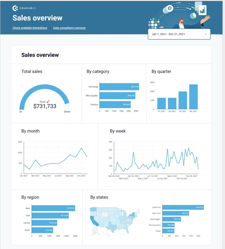
Since it’s a free tool, you should not expect ultra-advanced data visualization features. However, even what you have can be enough to create a solid professional looker Studio marketing dashboard that you can easily share with stakeholders, for example, like this:
Power BI
Microsoft Power BI is the third most popular data visualization tool in our recommended toolbox. It’s a business analytics and data visualization service to create interactive dashboards and reports. Its desktop version is free, but, as you may have guessed, it’s limited. The pricing for Power BI starts from $9.99/user/month, and you can try it out for free with a trial version.
What dashboards can you build with Power BI? Very powerful ones like this:

Check our article on Power BI visuals for more on this topic.
Use marketing data visualization to make data-wise decisions
The key finding of this guide is that marketers need to have data visualized for decision-making. How is that? The thing is that recognition of data in visual form facilitates cognitive processes. A chart with a trendline going down allows you to more quickly understand that something went wrong rather than an array of numbers in descending order. This is the main value of efficient data visualization – it lets you make a weighted data-driven decision. Can this decision be wrong? Yes, but if you’ve made a thorough data analysis supported by an advanced dashboard showing the results, the chances to muff a shot will be lower.
Check our article on marketing reporting templates to learn more about efficient ways to visualise your data.
Good luck with your data!


